Friday, December 31, 2010

Recapping 2010 in photos

I just put up a set of 62 of my favorite images from 2010. Included below are 12 of those.

Looking forward to more photos, more questions and answers, and more fun in 2011. Send me your questions and comments. Thanks!

Trollaween

Suzanne
Adrienne

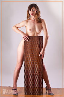
Vertical Girl
Space Needle

Tristen and Finnegan
Greenwood Car Show
The Lingerie Addict
Kevin
Iva Handful
K T
Eleya and Heather Rose
Happy New Year!

Thursday, December 23, 2010

Going with what you've got

Each year there is a procession of decorated boats in the waters around Seattle. They start out at the beginning of December, going to various locations around the Puget Sound and culminate on December 23. One of the main stops on Dec 23 is Lake Union, near Gasworks Park.

The weather is always a concern. Two years ago we had big snowstorms and the snow covered hills of Gasworks park nicely reflected the lights from the boats and from the city skyline. I had my trusty Canon G9 with me that evening and realized that there wasn't going to be much chance of getting a clear image of the boats. Between the darkness, me hand holding the little camera, and the movement of the boats on the water, I had to go outside the box.

I went back to my mantras of "embrace the blur" and experimented with camera motion to make more abstract captures. I really enjoyed them, and was back out there again this evening in the light rain with my Canon G10.

I turned off the built-in image stablization on the camera, held it in front of me and tried various wrist movements to see what I could capture. Sometimes I rolled my wrists, sometimes I swirled. Sometimes I just moved in random motions. Here are some of the results:


The crowd in Gasworks Park in 2008


In one of those acts of synchronicity, Craig Tanner has picked one of my holiday ships images for Photo of the Week on The Mindful Eye website.

Thursday, December 16, 2010

A few more...

I realized I didn't include any full-length images using the white diffuser on the PLM in the previous post. Here are some examples with the diffuser...

f/5.6, 1/6 second
f/6.3, full power
f/6.3, full power

More PLM photos

Nothing to compare this time, just some examples to look at. I took the PLM to my office today and we played around with it in a camera club meeting. These were taken with a Speedotron 805 pack and 102 head with the 84" PLM. These are all without the diffuser except for the last image. The camera was a Canon 5DmkII with the 70-200 f/4 L IS lens. The PLM is approximately 16 feet from the subjects, I am standing in front of the PLM. Background is white seamless, just a short distance behind the subjects.
This gives an idea of the size of the PLM
f/5.6, strobe power lowered down

f/13, full power (800ws)

f/13, full power

f/14, full power

Looking into the PLM, f/22, 0.3 seconds, lens zoomed during exposure
f/32, 0.5 seconds, lens zoomed   


f/5.6, with diffuser

Tuesday, December 14, 2010

More light comparisons

About a week ago I got an 84" silver PLM* from Paul Buff (Alien Bees/White Lighting). I haven't had a chance (or the room, this is a very large item) to really give it a good test, but this evening I had some time available to do a set of comparison images with the PLM and a few other light modifiers. The PLM is mounted to the light using the new speed ring assembly that I modified to fit my Speedotron flash heads.

I will start by saying that I really don't like using a mannequin for lighting demonstrations. The surface of the mannequin doesn't mimic skin, and the eyes have painted in catch lights. But it does allow me to have a "model" that doesn't move between images while I'm changing out the lights. So, when looking at the following examples, pay more attention to the edge of the shadow that the mannequin casts. See which lights will give you harder or softer shadows.

The mannequin in this series is 18" in front of the background. This is much closer than I would normally place a portrait subject. But for beauty or experimental work I might sometimes have the model right against the background. The light stand is 117" (9.7 feet, 2.3 meters) from the nose of the mannequin. The light is situated just over my left shoulder, almost straight on to the mannequin in all but the last image. The last image is with a ring light, so the camera is on axis with the light.

All but the last image were taken with a Speedotron 805 power pack at its lowest power setting for one lamp head (50 watt seconds) going to a 202 flash head. The last image was lit with an Alien Bees ring light at its lowest power setting. The light stand is in the exact same position, though it was lowered a few inches for the last image (ring light). The power pack was left at the same power level for all photos. The aperture was adjusted to get proper exposure (I took a series of bracketed shots and selected the best from each series). The aperture each image was taken at is shown in the examples below. This should give you an indication of the efficiency of each modifier.

The modifiers used were: Silver PLM, Silver PLM with diffuser, bare bulb (flash head pointed towards the subject), 7" silver reflector, 7" silver reflector with 20-degree grid, 7" black reflector with snoot, 22" Speedotron beauty dish, 42" Photoflex umbrella (white reflective with black backing), 60" Photek Softlighter II, 60" umbrella (the Softlighter without its diffuser), 24" square Interfit soft box (white interior and interior baffle), and Alien Bee ring light. Camera was a Canon 7D with the Canon 100mm f/2.0 lens. Camera to subject distance is about 9.5 feet.

There were no fill/bounce cards. Just the one light.

I converted to black and white so that the color of the mannequin and background and slight differences in the color from each modifier wouldn't affect perception of the shadows. I've also included a color version to give an idea of the difference in color between the various modifiers on the lamp head.

       
      Click to enlarge
 
Click to enlarge

I hope to soon get to do a set of examples of the PLM compared with other modifiers with a full length subject and more distance between the light and subject and between the subject and background. Just need to find the space to do it in...

ADDENDUM: Adding a photo of the PLM with the Speedotron head (this photo was taken before modifying the adapter plate, so it is attached like an umbrella). This is shown in a standard 8' ceiling room to give an idea of the size:
If there is a comparison you would like to see please let me know.

Thanks!

PS: I've had some questions about adapting the PLM to a Speedotron head. Here are a couple of snapshots of the modified Speedotron speedring:
The black part is the Speedotron speedring. The chrome part is the included Paul Buff/Alien Bees speedring connector, which has its own speedring. I removed the AB speedring and drilled holes in the Speedotron speedring to match the three legs from the AB adapter.

I also slightly bent the lip on the Speedotron speedring to match the angle of the legs from the Alien Bees speedring attachment.


Here it is attached to a 102 lamp head
Note that the three legs from the AB adapter clear the flash tube cover on the 102 head. I found that the larger flash tubes on the 202 and Force mono lights touch the legs. So I only use this set up with the Speedotron 102 heads.


* for those waiting for their backordered PLM, I ordered mine on June 13 (2010) and received it on December 2 (2010).

Wednesday, December 8, 2010

Thinking about Catch Lights

For me, eyes are the center piece of a great portrait. I want to see life in the eyes. I also want to see a catch light. The catch light is the highlight reflection of a light source on the outer surface of the subject's eyes. Pretty cut and dried.

But it can get interesting and contentious when we start talking about the shape of the catch light. And it can get religious when we talk about the number of catch lights. Let's take on the issue of shape first.

I've seen a number of articles saying that catch lights should be round. The roundness would mimic a reflection of the sun, which is round. I don't agree. I don't think that we really notice the sun reflection in the eyes of someone we are looking at. Instead, I think of catch lights as mimicking a window or a doorway. These are usually rectangular shapes. So I often prefer the look of a rectangular softbox catch light. Even outdoors, I think we are more likely to notice a large diffused sky as a highlight in the eye than we are to notice the sun. With a strong sun, the subject would usually be squinting, tearing, or looking off in a different direction.
rectangular catch light
Above is an eye with a rectangular catch light. Referring back to my comment about mimicking a door or window, I added some black tape across the face of my softbox to create these catch lights...

When using a beauty dish we do end up with round catch lights. But the catch light is large. Not a small point (as the sun would be).

Also note the size of the pupils in the examples here. For my taste, the one above is a bit too small. I much prefer the look of the pupil in the image below. I talked about this a couple of days ago in my post about using beauty dishes (see the FLASHLIGHT section).
Then, of course, there are ring lights. This is a self portrait lit with an Alien Bee ring light with the 56" moon unit. Not something to use all the time. But a nice change of pace to use once in a while.

What about the number of catch lights?
Most traditional photographers will say just one light showing in each eye. Again, this goes back to the sun. There is only one sun in the sky. So one main light that reflects in the eyes. Personally, I don't usually notice multiple catch lights in photographs I look at. I much prefer multiple catch lights to no catch light at all. I think I will just let others fight that battle. Paraphrasing my old friend Bruce Fraser, "that is one hill that isn't worth fighting or dieing over."

Bottom line? Make the eyes look good!

Tuesday, December 7, 2010

Grids versus Snoots

Another question that came up during the Experimental Portrait class was "what is the difference between using a grid vs using a snoot?" I commented during the class that the grids had softer edges while the snoot had a harder edge to the light.

Here are some examples using 10-, 20-, 30-, and 40-degree grids and a snoot.

 
click to enlarge
The first shot in the sequence is using a plain 7" reflector on a Speedotron Force 5 monolight. The next four in the sequence are the 10, 20, 30, and 40 degree grids. The sixth image is using a Speedotron snoot on a silver 7" reflector. The last image in the sequence uses the snoot on a black reflector. The black reflector is designated for use with snoots and is not a very common item.

In this next sequence I just moved the camera back a bit so that you can better see the edges of the light.

Click to enlarge
And a set of images of the grids and snoot pointed at a blank wall to better see their patterns:
Click to enlarge
In case you are not familiar with these items, here are photos of the reflectors, grids, and snoot...


The snoot is basically a black tube that goes in front of the flash head to narrow the light output. The grids have a honeycomb pattern of metal (usually aluminum) that narrows the light beam. On-axis a lot of light can go through, but as you move off-axis the light is attenuated.

Monday, December 6, 2010

Beauty Dish Examples

As promised earlier, here is a set of images taken with a 22" white beauty dish. The images are with just the dish, the dish with a diffusion sock, the dish with a grid, and the dish with a grid and diffusion sock. Camera is a Canon 5D mkII with a 100mm f/2.0 lens. ISO 100. Speedotron Force 5 monolight with Speedotron 22" beauty dish. The back of the mannequin's head is 3-1/2 feet from the background. Mannequin's nose to focal plane of the camera is 56" and the nose to beauty dish distance is 33". There is a white fill card to the camera left 12" from the ear that shows (just out of frame). No other lights.

22" beauty dish

22" dish with diffusin sock
22" dish with grid

22" dish with grid and diffusion sock

The light, camera, model, and background positions remained the same for each test. The lens aperture was adjusted to maintain approximately the same exposure for each. The dish alone was at f/7.1. Dish with sock was f/5.6. Dish with grid was f/5.6. The grid and sock together sucked up a lot of light and that version was at f/2.0.

Obviously, the big aperture change for the last image contributes to the very different look (very shallow depth of field), so I also did the last example (dish and sock) with the strobe power turned up so I could be at f/5.6 and here is what that looks like...
22" dish with sock and grid at f/5.6
You can see that by adding the sock (2nd image) the shadow side of the cheek opened up. Adding the grid (3rd image) adds contrast. The 4th image with grid and sock opens up the shadows again, but still maintains some contrast. The image is overall softer because it was shot wide open with a 100mm f/2.0 lens. The fifth image is a better comparison shot, as it was taken at f/5.6 like the individual grid and sock images.